Gauging the health and productivity of a software release cycle is notoriously difficult. Atomic age metrics like “man months” and LOCs may be discredited, but they are too often a reflexive response for DevOps problems.
Instead of understanding the cycle itself, management may hire a “DevOps expert” or homebrew one by taking someone off their project and focusing them on “automation.” Or they might add man months and LOCs with more well-intentioned end-to-end tests.
What could go wrong? Below, I’ve compiled some metrics and tips for building a release cycle health dashboard using Sumo Logic.
Measuring Your Software Release Cycle Speed
Jez Humble points to some evidence that delivering faster not only shortens feedback but also makes people happier, even on deployment days. Regardless, shorter feedback cycles do tend to bring in more user involvement in the release, resulting in more useful features and fewer bugs. Even if you are not pushing for only faster releases, you will still need to allocate resources between functions and services. Measuring deployment speed will help.
Change lead time: Time between ticket accepted and ticket closed.
Change frequency: Time between deployments.
Recovery Time: Time between a severe incident and resolution.
To get this data to Sumo Logic, ingest your SCM and incident management tools. While not typical log streams, the tags and timestamps are necessary to tracking the pipeline. You can return deployment data from your release management tools.
Tracking Teams, Services with the Github App
To avoid averaging out insights, Separately tag services and teams in each of the tests above. For example, if a user logic group works on identities and billing, track billing and identity services separately.
For Github users, there is an easy solution, the Sumo Logic App for Github, which is currently available in preview. It generates pre-built dashboards in common monitoring areas like security, commit/pipeline and issues. More importantly, each panel provides queries that can be repurposed for separately tagged, team-specific panels.
Reusing these queries allows you to build clear pipeline visualizations very quickly. For example, let’s build a “UI” team change frequency panel.
First, create a lookup table designating UserTeams. Pin it to saved queries as it can be used across the dashboard to break out teams:
"id","user","email","team",

"1","Joe","joe@example.com","UI"

"2","John","john@example.com","UI"

"3","Susan","susan@example.com","UI"

"4","John","another_john@example.com","backspace"

"5","John","yet_another_john@example.com","backspace"
Next, copy the “Pull Requests by Repository” query from the panel:
_sourceCategory=github_logs and ( "opened" or "closed" or "reopened" )

| json "action", "issue.id", "issue.number", "issue.title" , "issue.state",

"issue.created_at", "issue.updated_at", "issue.closed_at", "issue.body",

"issue.user.login", "issue.url", "repository.name", "repository.open_issues_count"

as action, issue_ID, issue_num, issue_title, state, createdAt, updatedAt,

closedAt, body, user, url, repo_name, repoOpenIssueCnt

| count by action,repo_name

| where action != "assigned"

| transpose row repo_name column action
Then, pipe in the team identifier with a lookup command:
_sourceCategory=github_logs and ( "opened" or "closed" or "reopened" )

| json "action", "issue.id", "issue.number", "issue.title" , "issue.state",

"issue.created_at", "issue.updated_at", "issue.closed_at", "issue.body",

"issue.user.login", "issue.url", "repository.name", "repository.open_issues_count"

as action, issue_ID, issue_num, issue_title, state, createdAt, updatedAt,

closedAt, body, user, url, repo_name, repoOpenIssueCnt

| lookup team from https://toplevelurlwithlookups.com/UserTeams.csv

on user=user

| count by action,repo_name, team

| where action != "assigned"

| transpose row repo_name team column action
This resulting query tracks commits — open, closed or reopened — by team. The visualization can be controlled on the panel editor, and the lookup can be easily piped to other queries to break the pipeline by teams.
Don’t Forget User Experience
It may seem out of scope to measure user experience alongside a deployment schedule and recovery time, but it’s a release cycle health dashboard, and nothing is a better measure of a release cycle’s health than user satisfaction.
There are two standards worth including: Apdex and Net Promoter Score.
Apdex: measures application performance on a 0-1 satisfaction scale calculated by…
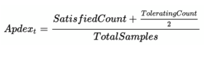
If you want to build an Apdex solely in Sumo Logic, you could read through this blog post and use the new Metrics feature in Sumo Logic. This is a set of numeric metrics tools for performance analysis. It will allow you to set, then tune satisfaction and tolerating levels without resorting to a third party tool.
Net Promoter Score: How likely is it that you would recommend our service to a friend or colleague? This one-question survey correlates with user satisfaction, is simple to embed anywhere in an application or marketing channel, and can easily be forwarded to a Sumo Logic dashboard through a webhook. When visualizing these UX metrics, do not use the single numerical callout. Take advantage of Sumo Logic’s time-series capabilities by tracking a line chart with standard deviation. Over time, this will give you an expected range of satisfaction and visual cues of spikes in dissatisfaction that sit on the same timeline as your release cycle.
Controlling the Release Cycle Logging Deluge
A release cycle has a few dimensions that involve multiple sources, which allow you to query endlessly. For example, speed requires ticketing, CI and deployment logs. Crawling all the logs in these sources can quickly add up to TBs of data. That’s great fun for ad hoc queries, but streams like comment text are not necessary for a process health dashboard, and their verbosity can result in slow dashboard load times and costly index overruns.
To avoid this, block this and other unnecessary data by partitioning sources in Sumo Logic’s index tailoring menus. You can also speed up the dashboard by scheduling your underlying query runs for once a day. A health dashboard doesn’t send alerts, so it doesn’t need to be running in real-time.
More Resources:
- How Do you Measure Team Success?
- On the Care and Feeding of Feedback Cycles
- Martin Fowler’s Test Pyramid
- Just Say No to More End to End Tests
- Quantifying Devops Capability: It’s Important to Keep CALMS
- 9 Metrics DevOps Teams Track
Building Software Release Cycle Health Dashboards in Sumo Logic is published by the Sumo Logic DevOps Community. If you’d like to learn more or contribute, visit devops.sumologic.com. Also, be sure to check out Sumo Logic Developers for free tools and code that will enable you to monitor and troubleshoot applications from code to production.
About the Author
Alex Entrekin served on the executive staff of Cloudshare where he was primarily responsible for advanced analytics and monitoring systems. His work extending Splunk into actionable user profiling was featured at VMworld: “How a Cloud Computing Provider Reached the Holy Grail of Visibility.”
Alex is currently an attorney, researcher and writer based in Santa Barbara, CA. He holds a J.D. from the UCLA School of Law.
